Cuervo
Specialty Coffee
SUMMER CAMPAIGN 2019
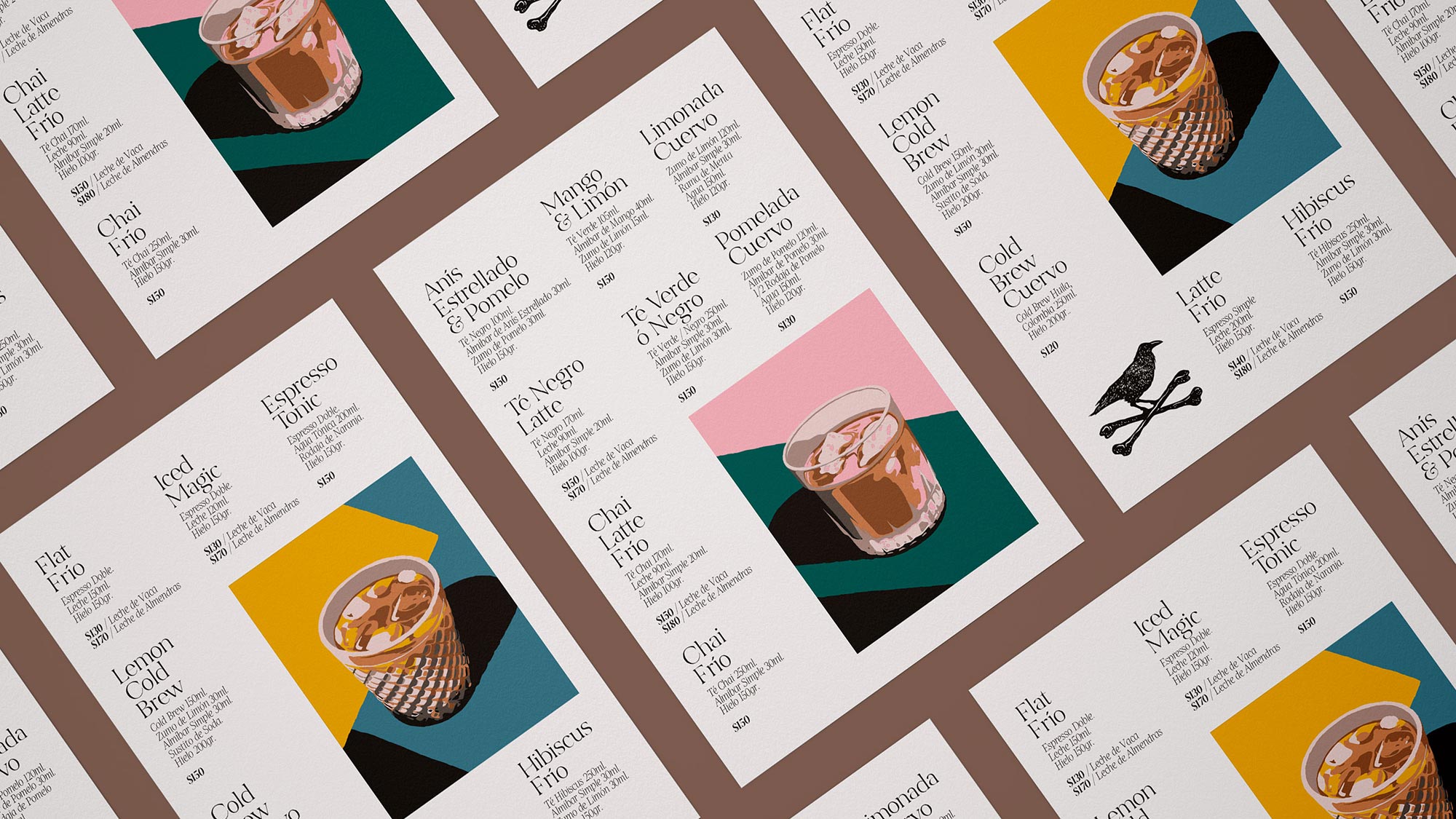
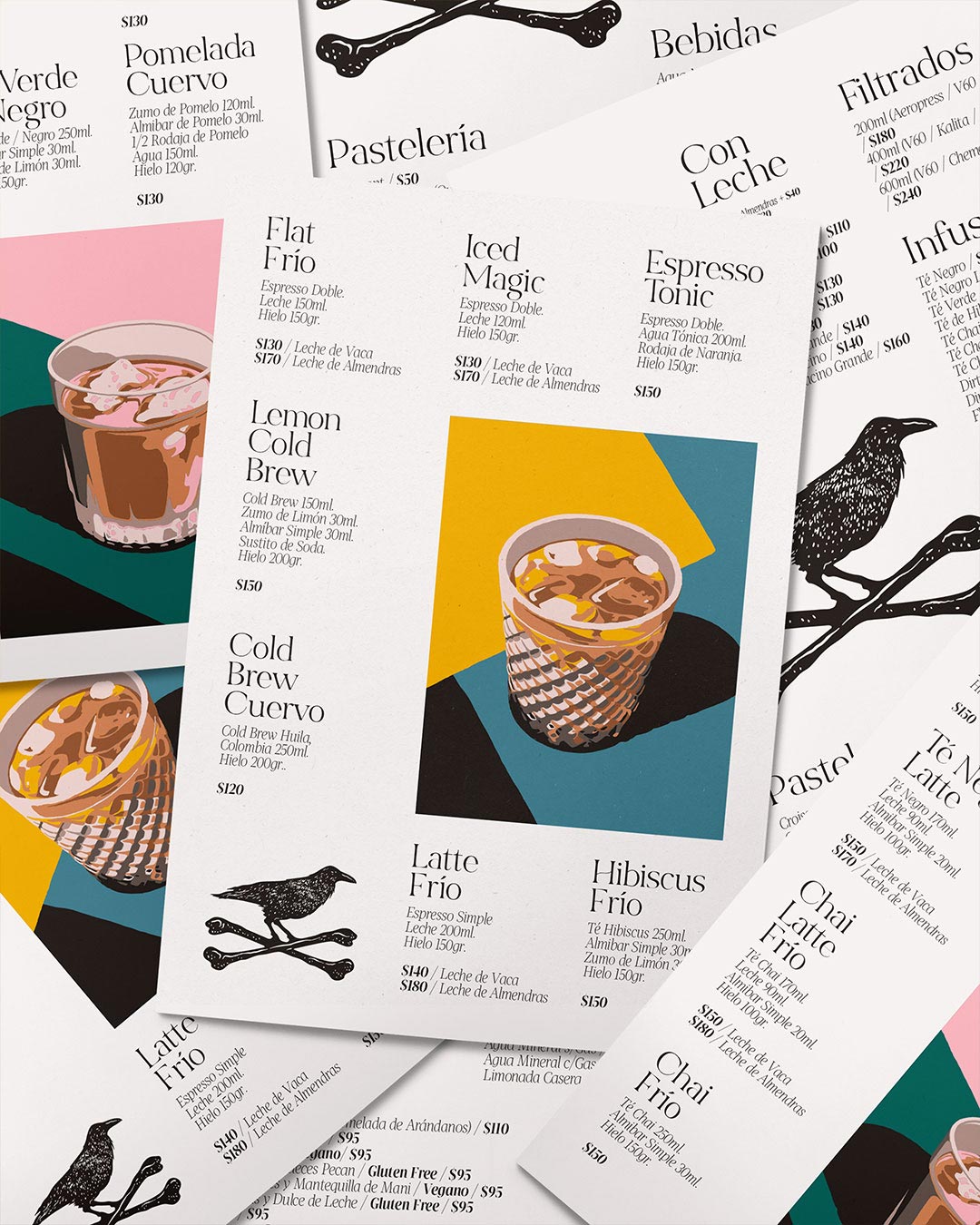
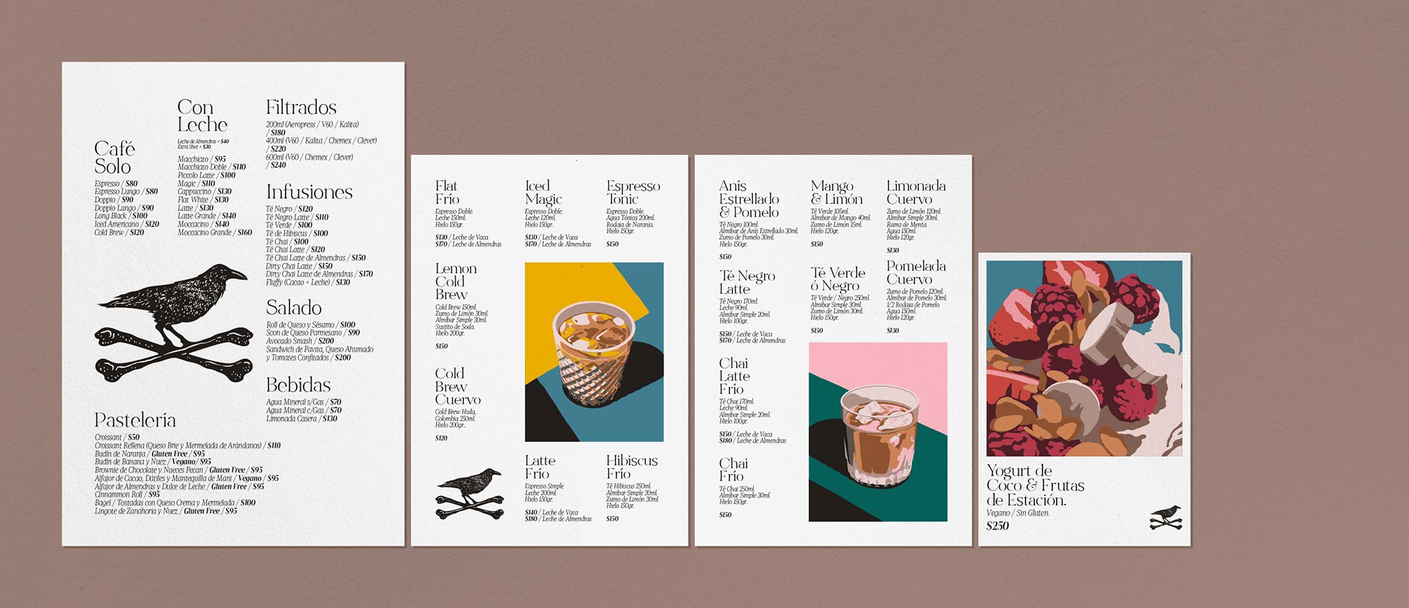
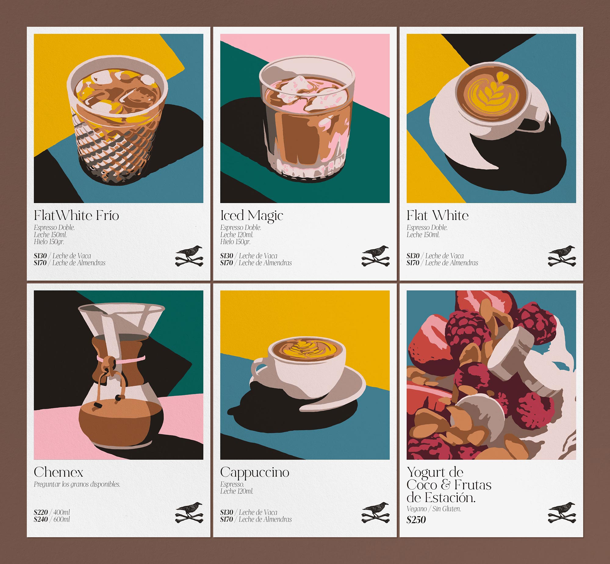
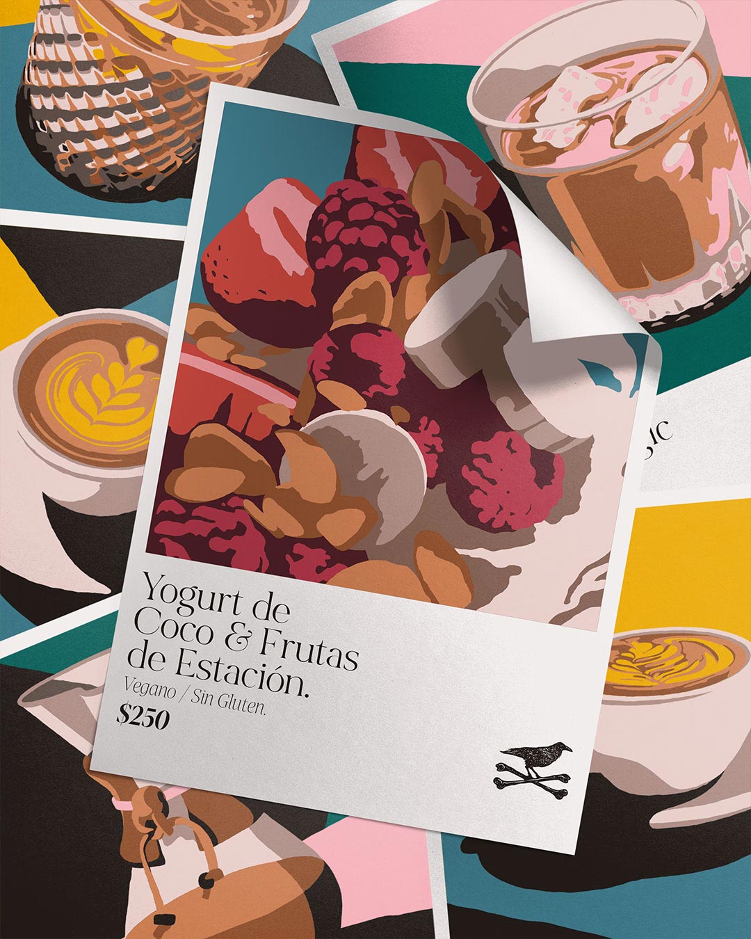
Following last year's campaign we developed for Cuervo Speciality Coffee , we wanted to change things up and focus our efforts towards print.
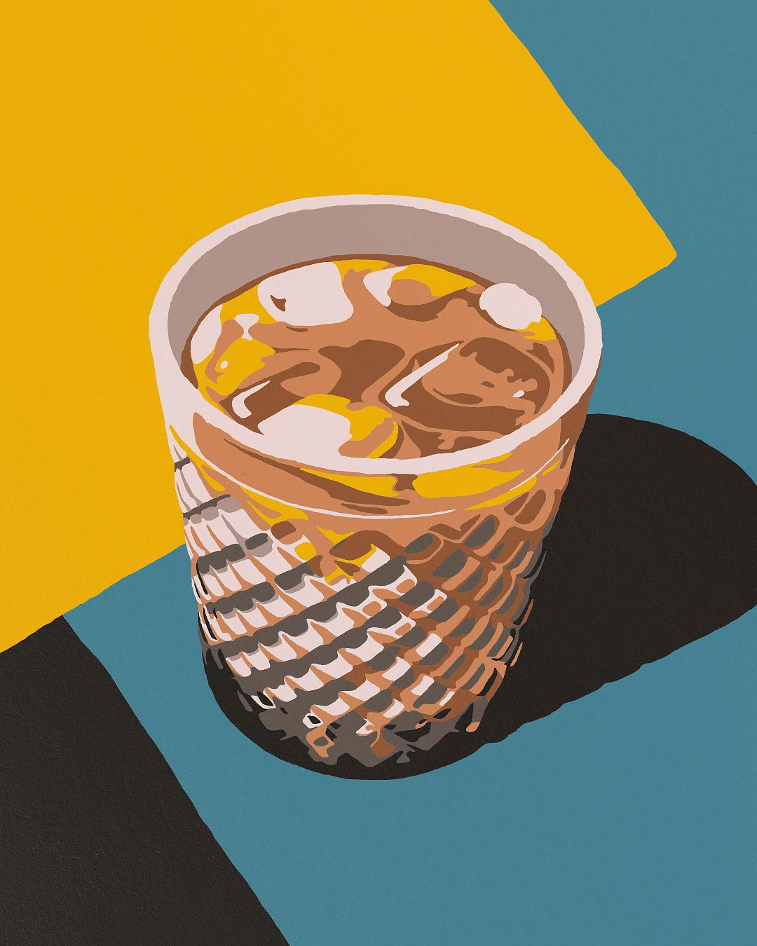
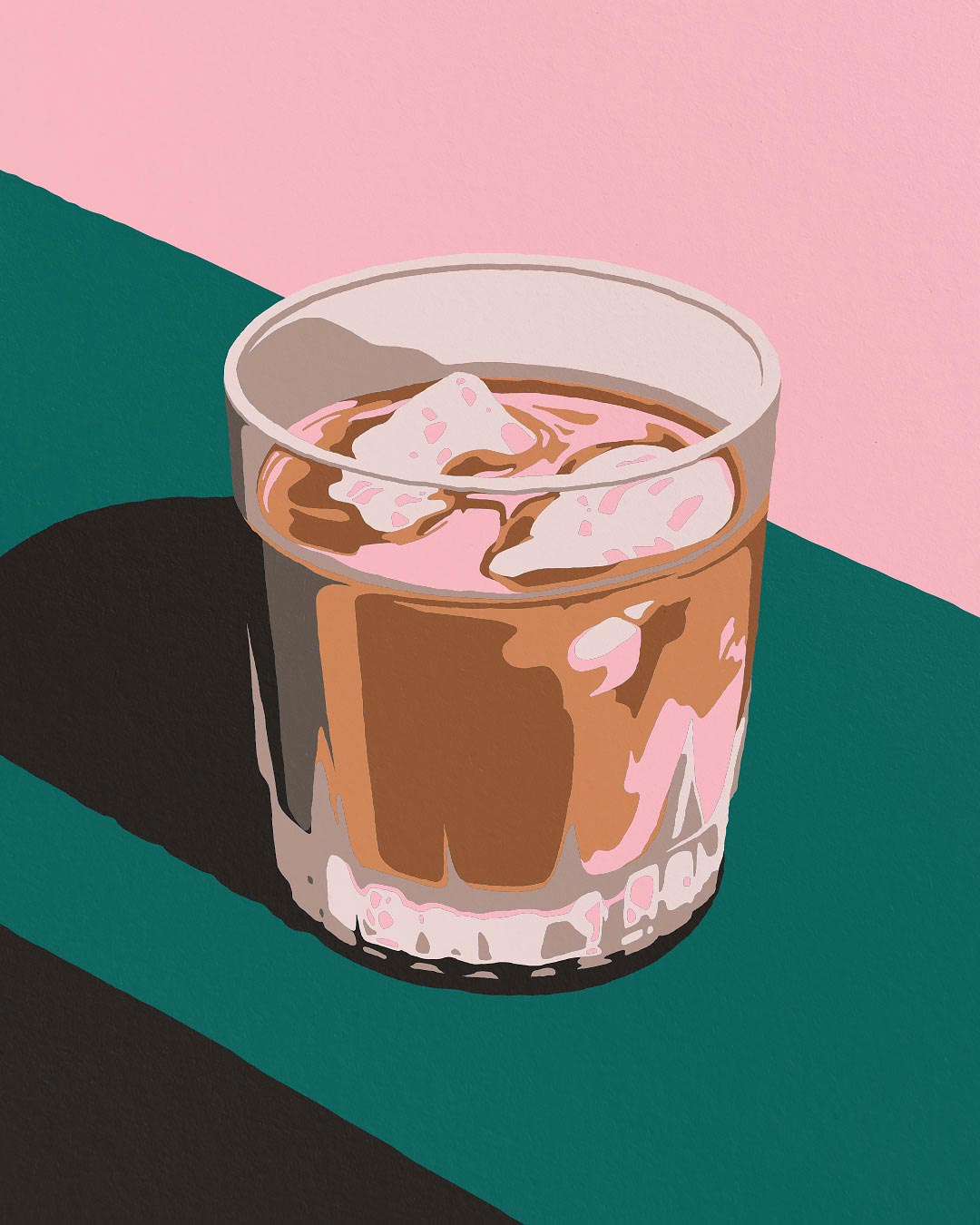
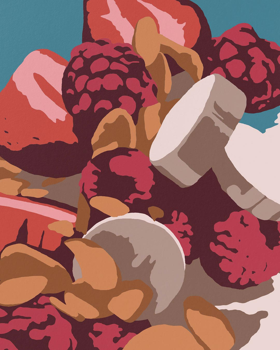
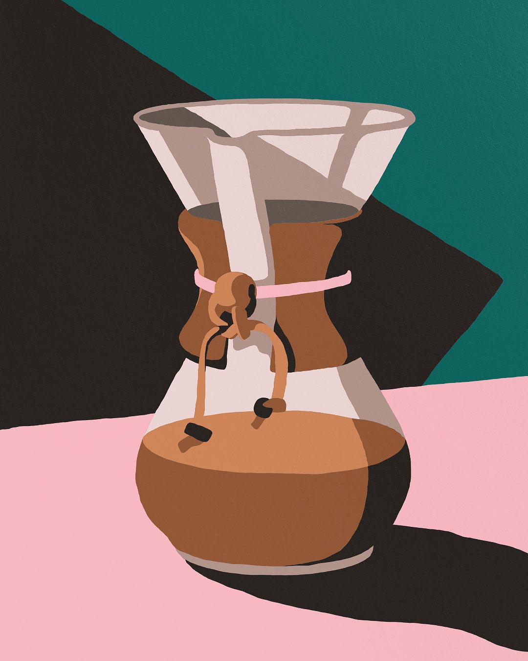
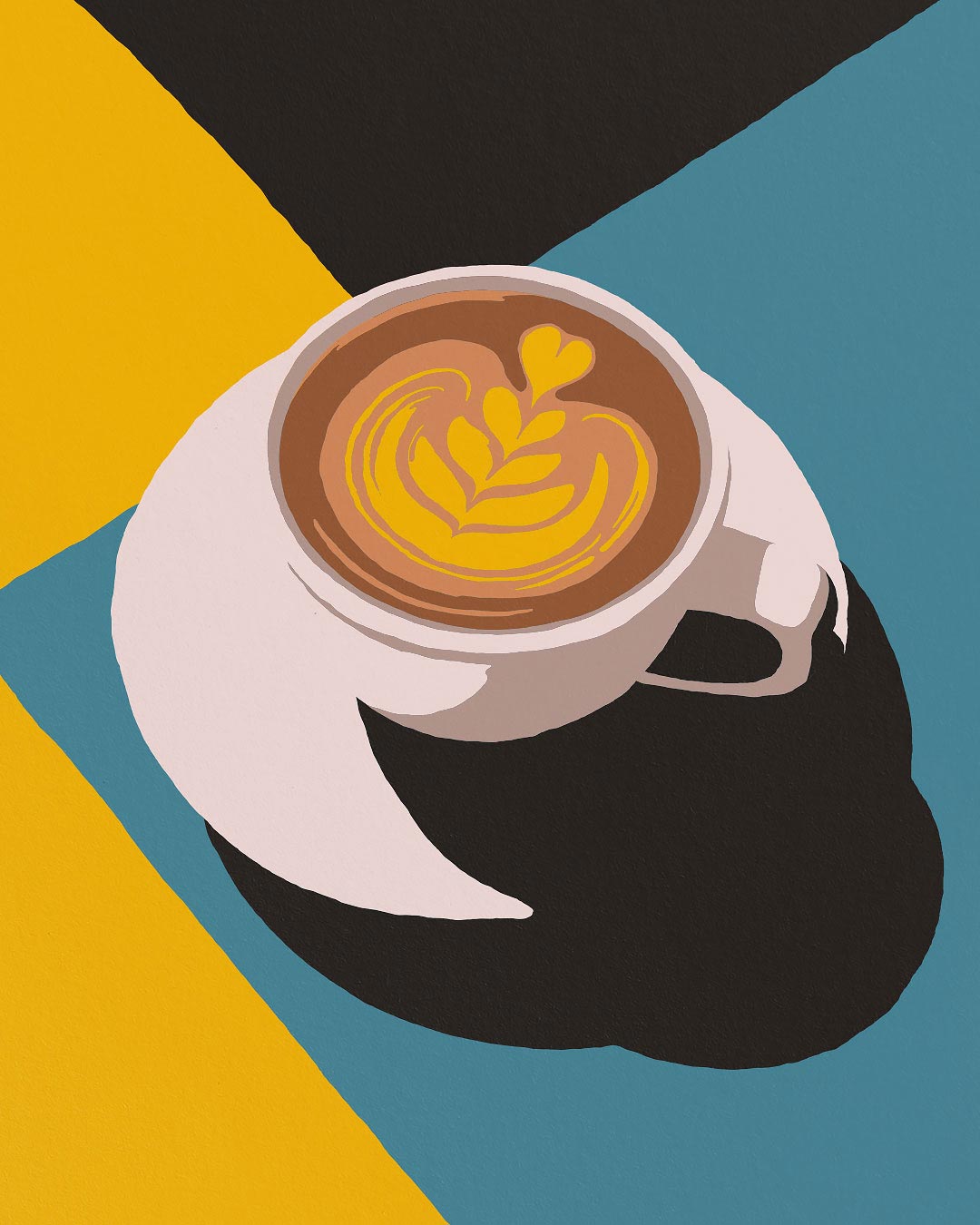
The current summer campaign proposes a new style of illustration that has "taste and feeling" as the basis for its foundation. As we know, photography is the best tool for getting both, emotion and desirability, across. But we've decided to stay fresh and iconic by picking an illustration style closer to its counterpart. A style that draws the hard shadows from a summery day and a color scheme that triggers the senses.
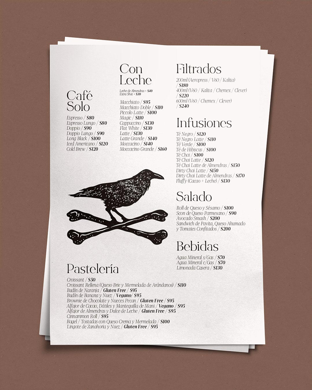
Along with the illustrations we wanted the design and typography choices to be simple. The goal was to elevate the perceived experience without being pretentious, so we switched the lively for the mature. A balanced blend of a Fine Dining Restaurant with a Rough-Edged & Color-Fuelled Illustration Style.
The last and most important decision in this campaign was to limit its reach only to print. Customers are the stars of Cuervo's social media and the platform itself is being refreshed all the time. Taking the campaign online would have exhausted the experience in no time. It's better to surprise the client than wearing them out.
Client: Cuervo
Production Company: Hueso
Director & Lead Designer: Gianluca Fallone
Executive Producer: Santiago Moncalvo
Illustration: Gianluca Fallone
All material included in this website belongs to Hueso©. It can not be copied, used or modified unless it is stated in a specific contract between the two parts. Hueso©2020 Copyright.
All material included in this website belongs to Hueso©. It can not be copied, used or modified unless it is stated in a specific contract between the two parts. Hueso©2020 Copyright.
