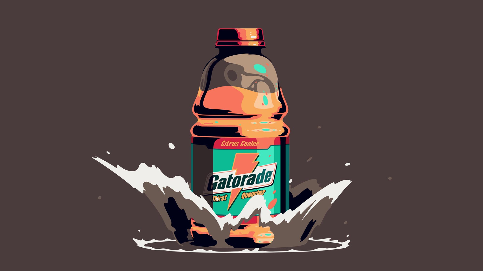
Gatorade
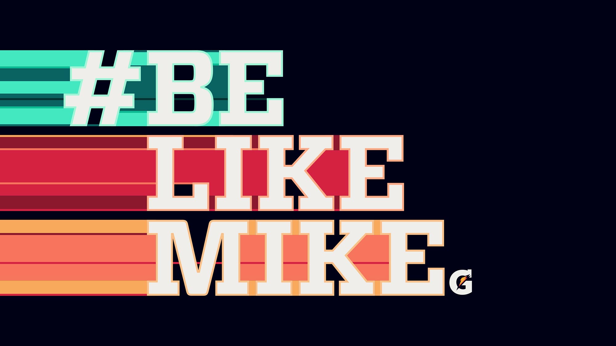
Be Like Mike
ANIMATION COMMERCIAL
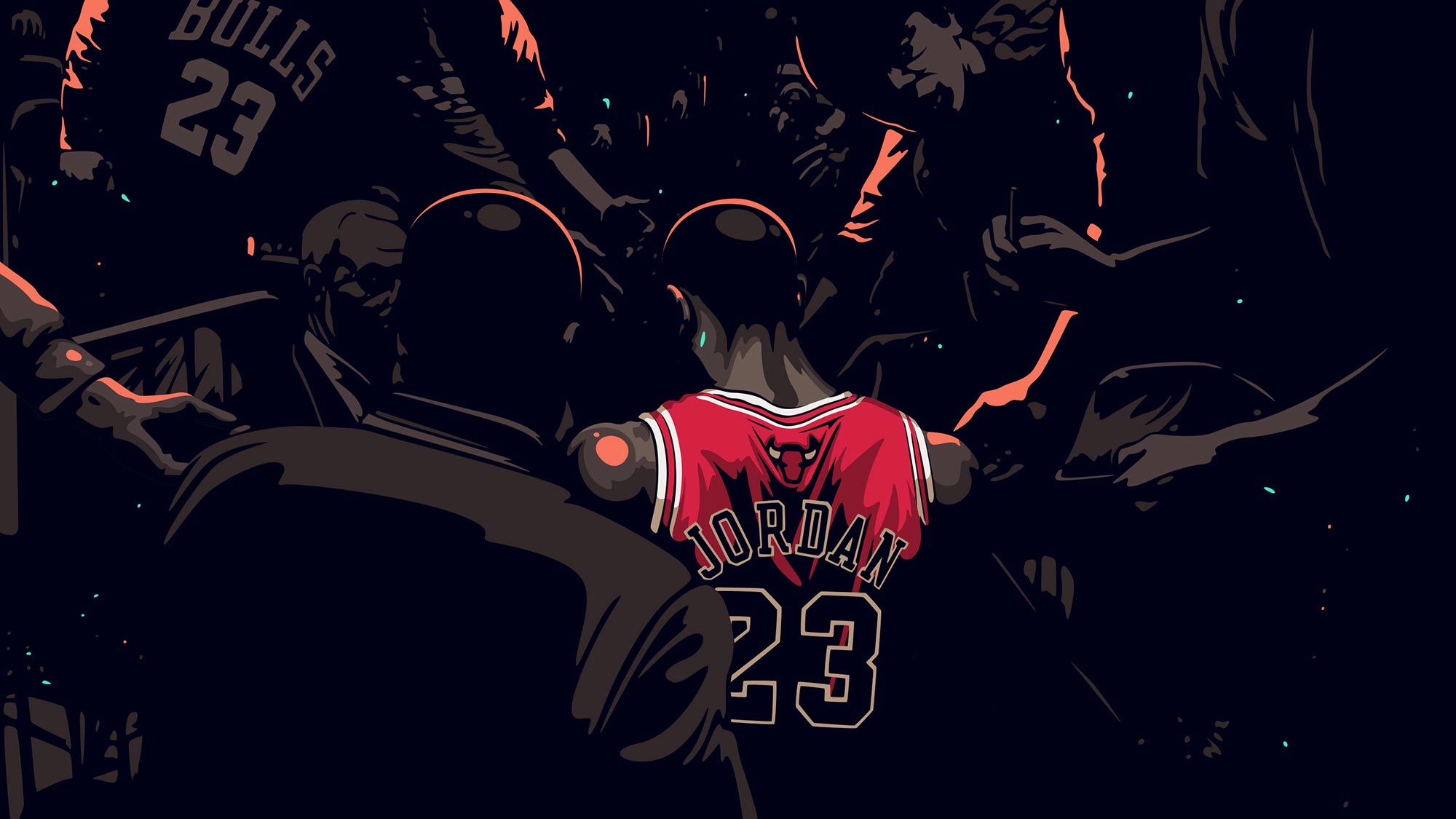
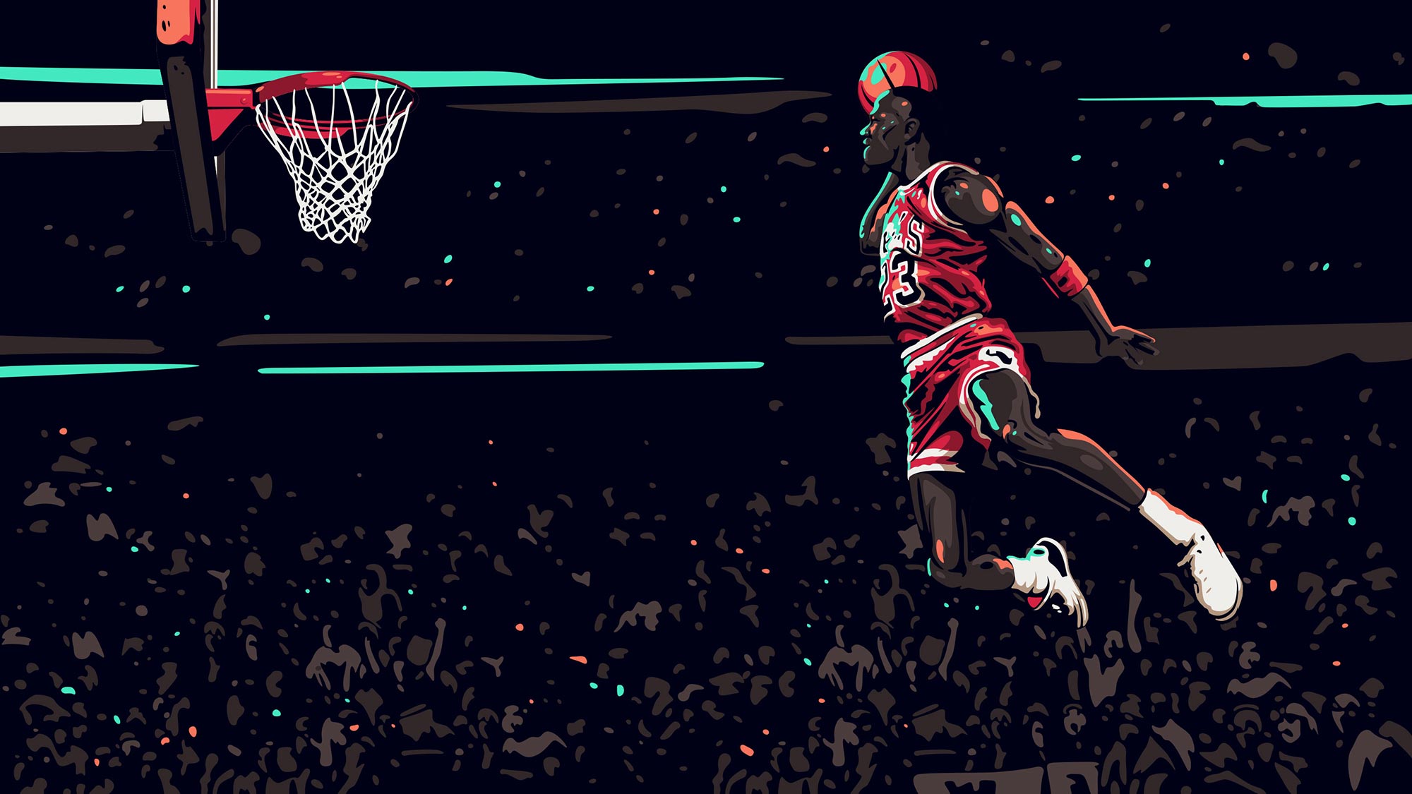
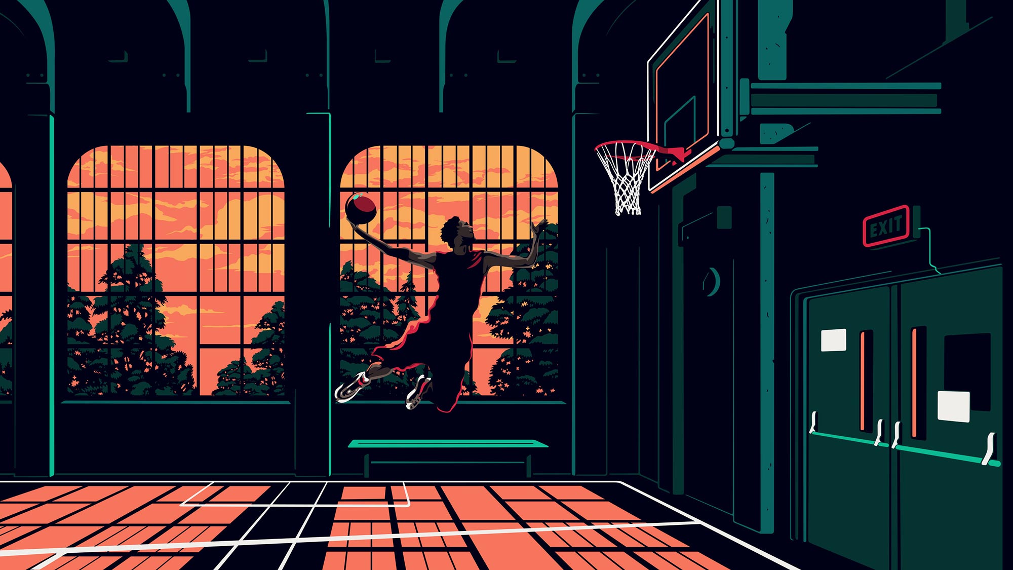
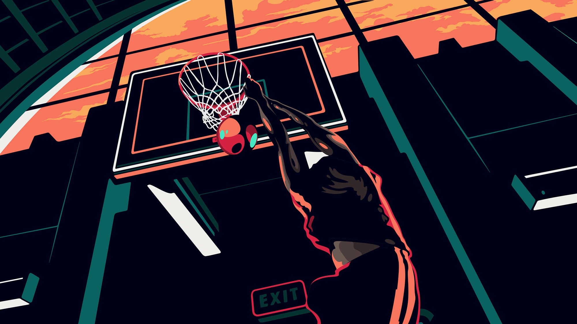
As part of it’s 50th Anniversary Celebration, Gatorade wanted to remaster it’s classic "Be Like Mike" commercial with Michael Jordan. It’s been more than two decades since the original and this project here was just one small part of a big campaign.
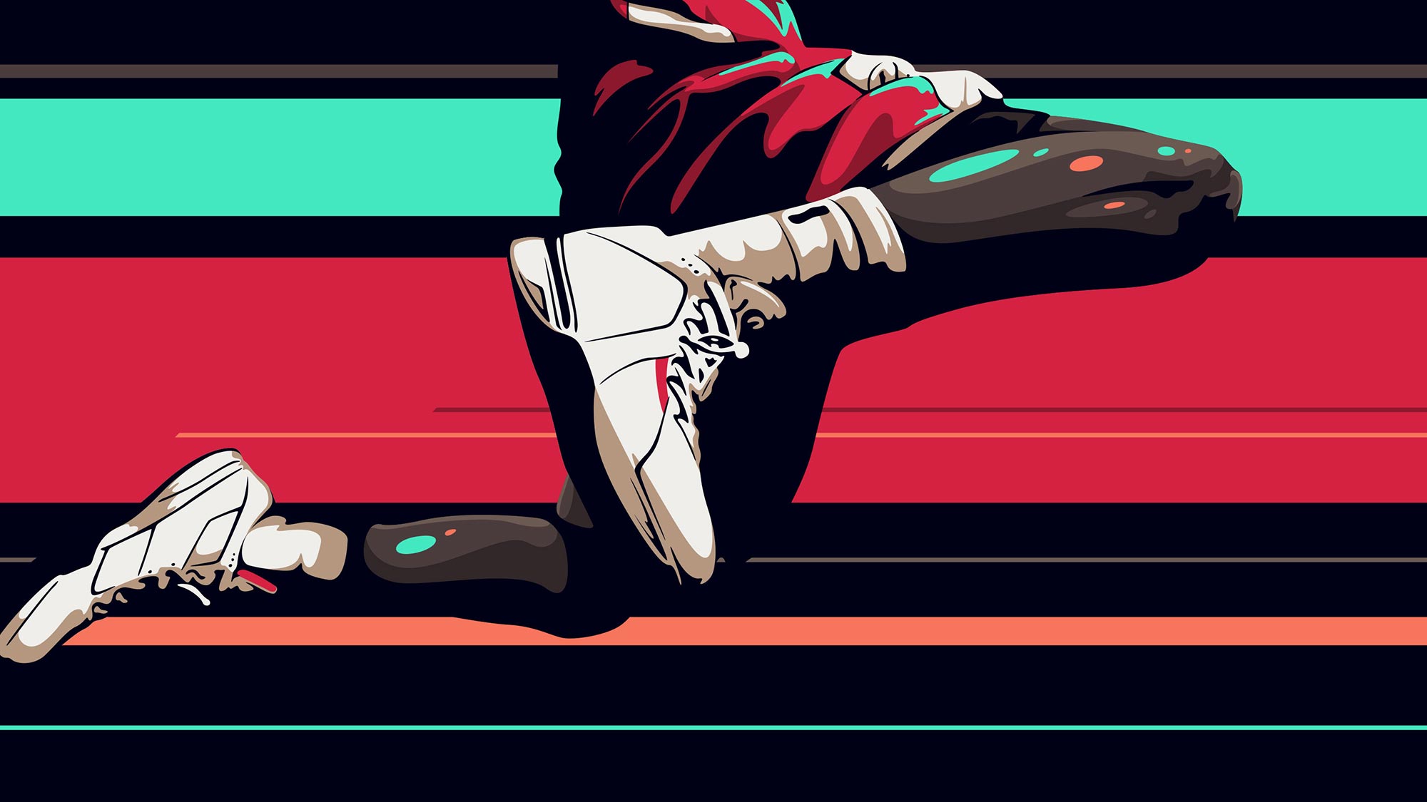
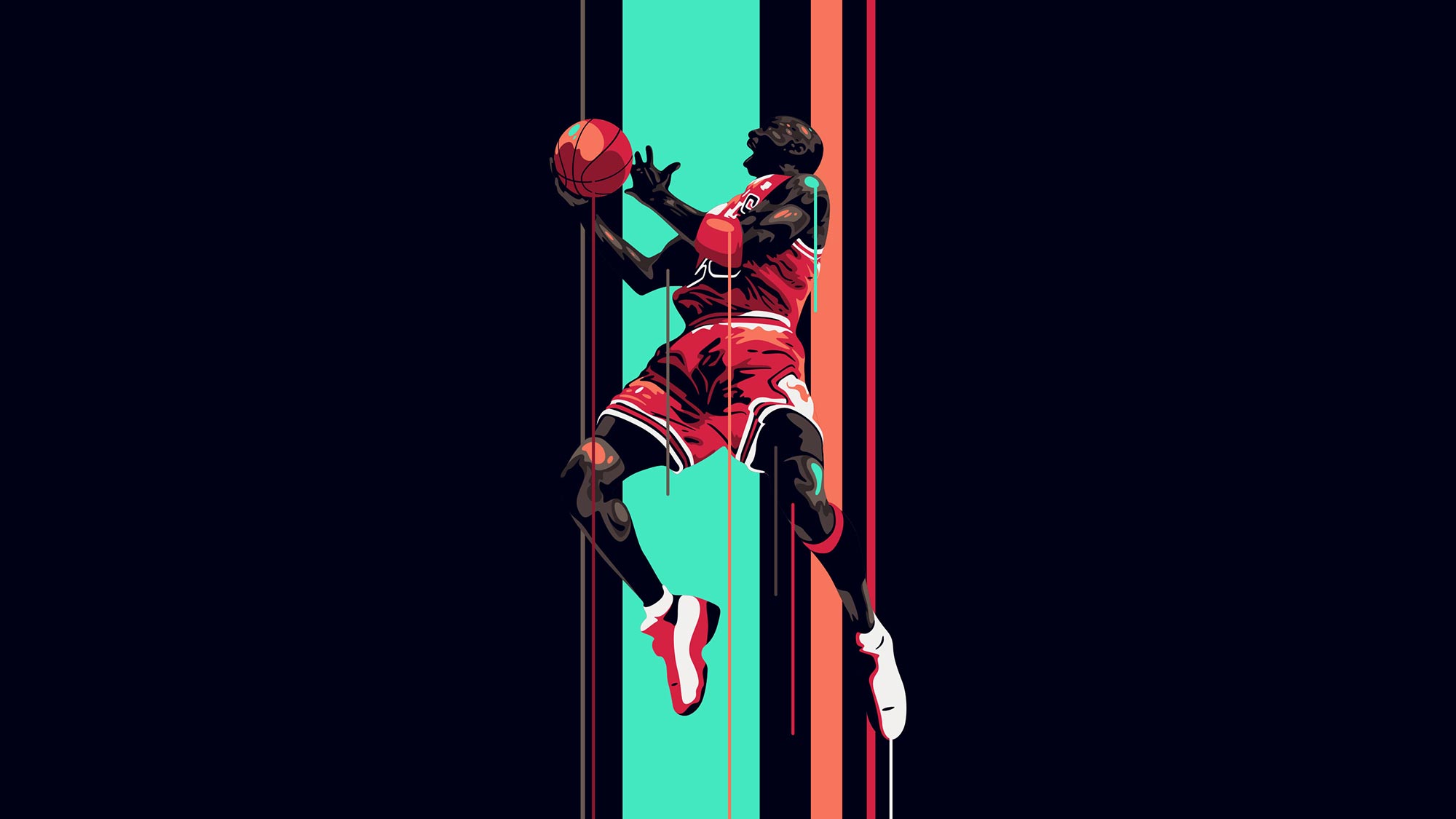
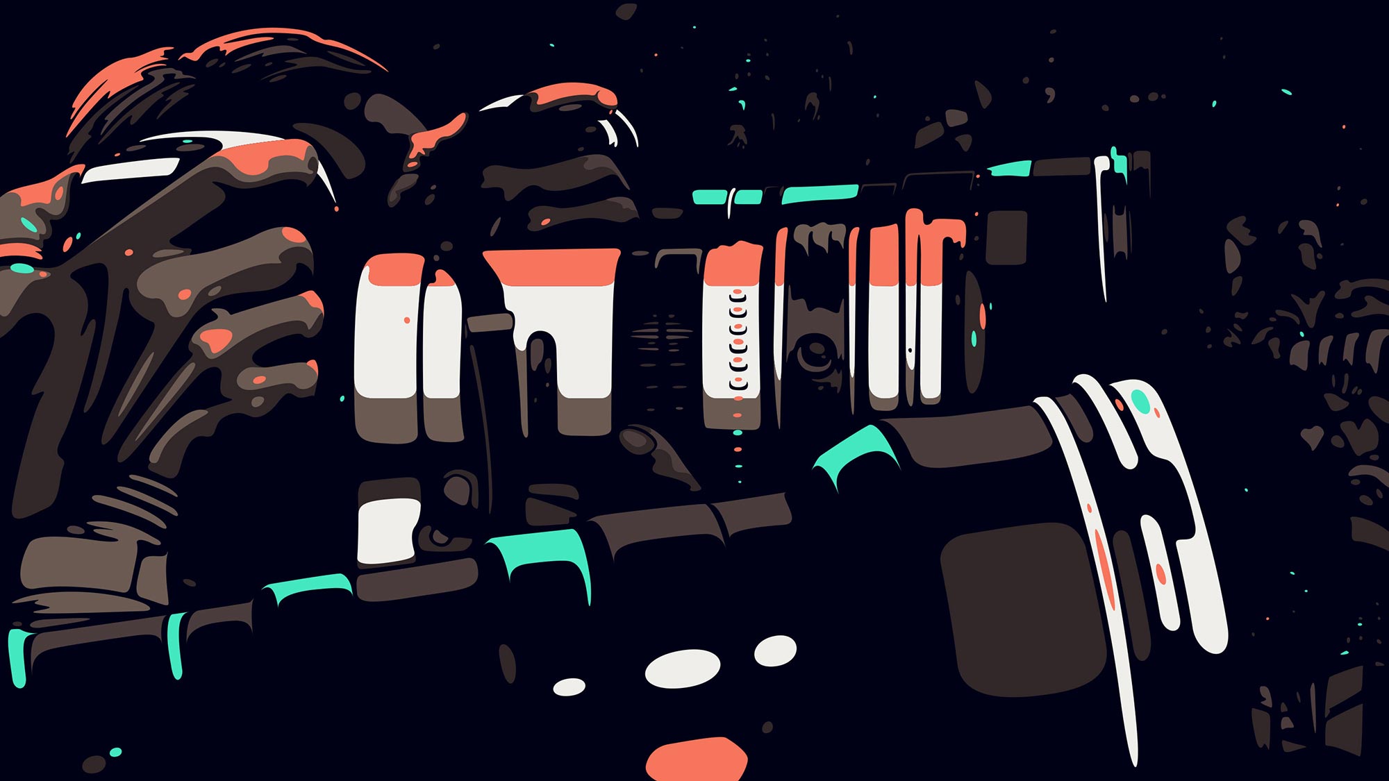
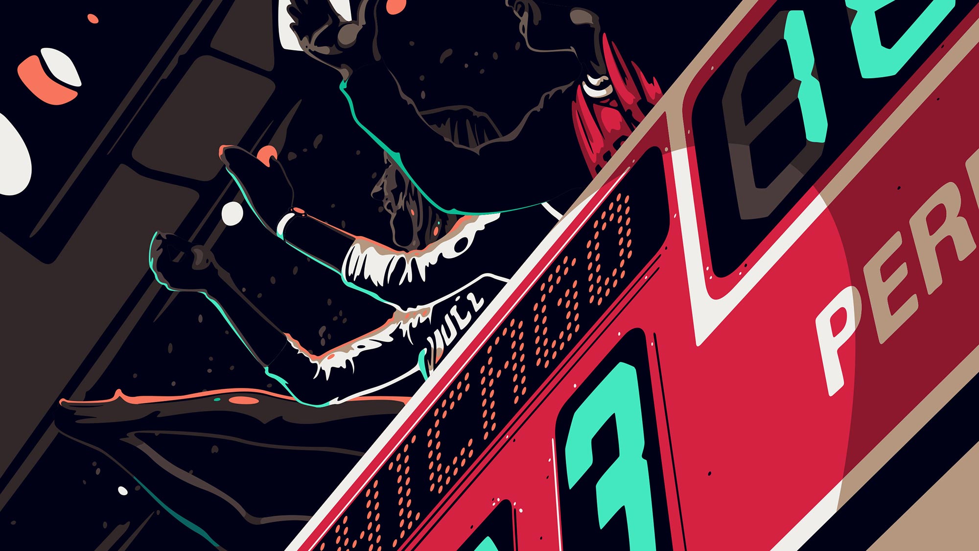
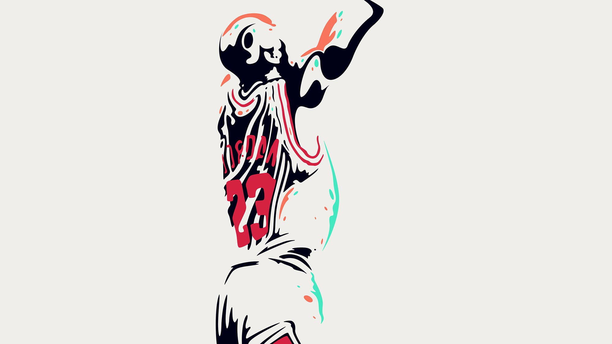
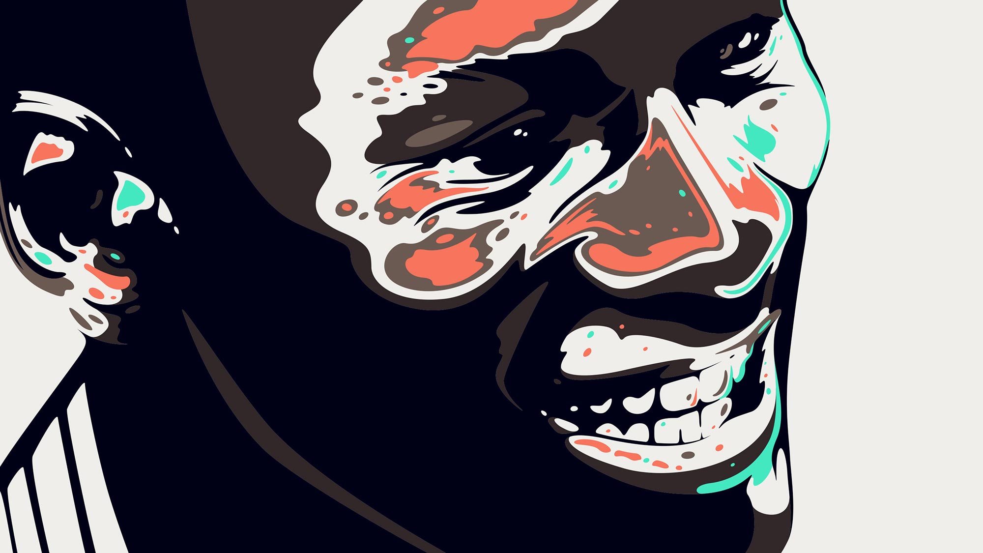
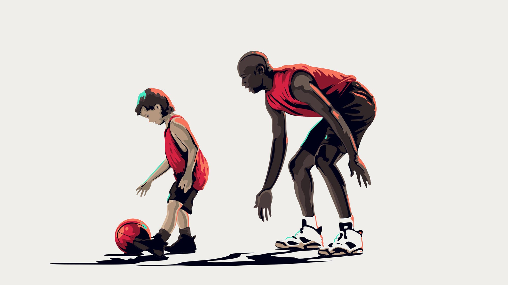
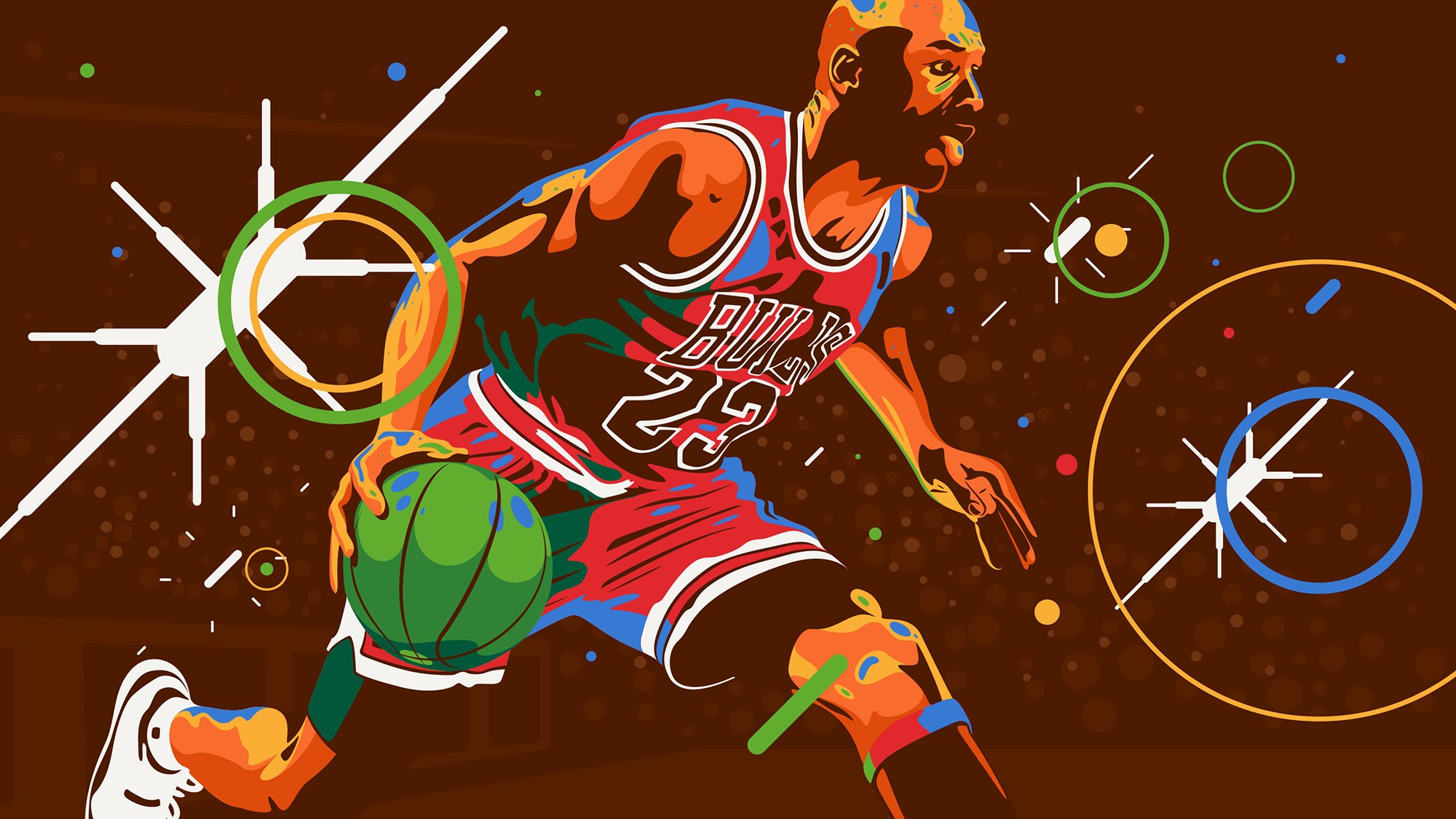
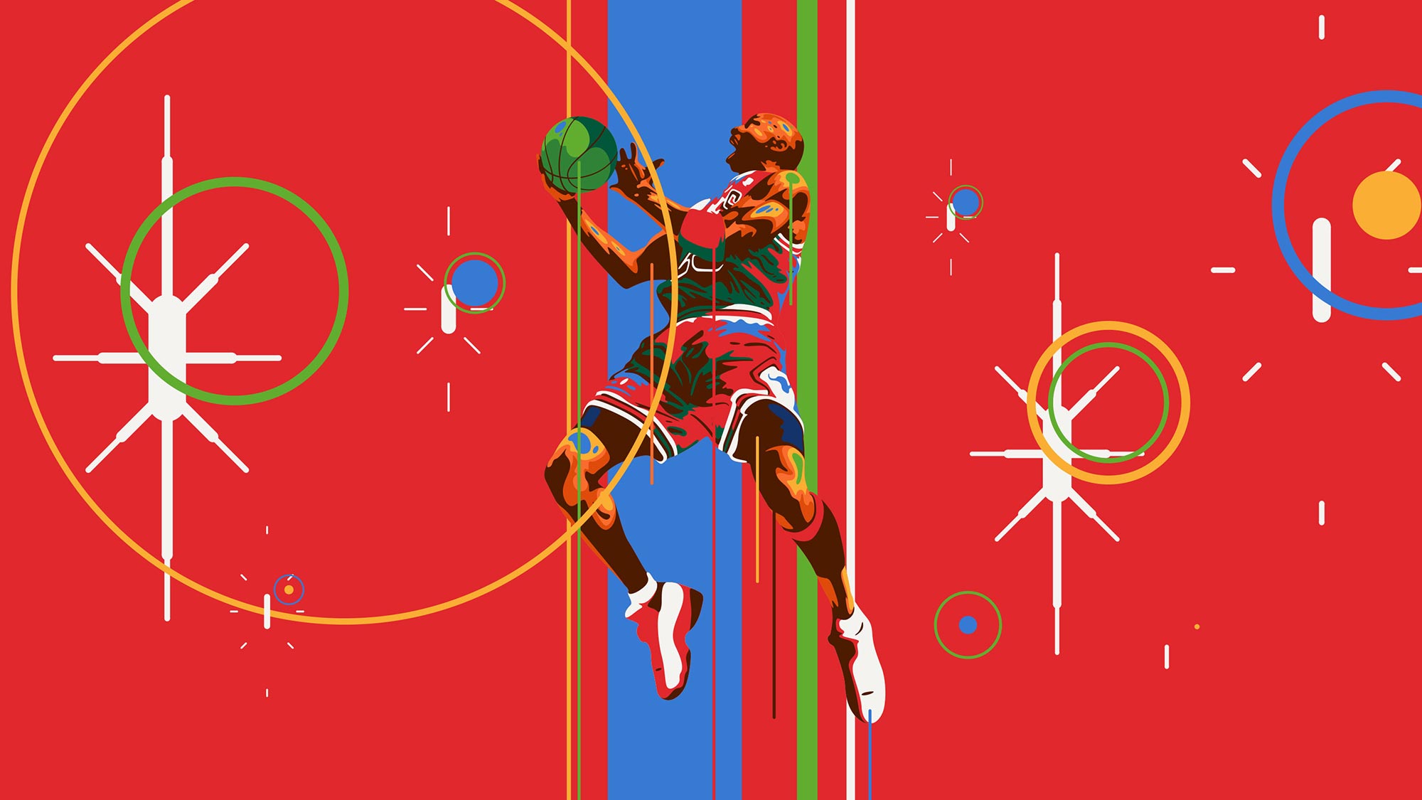
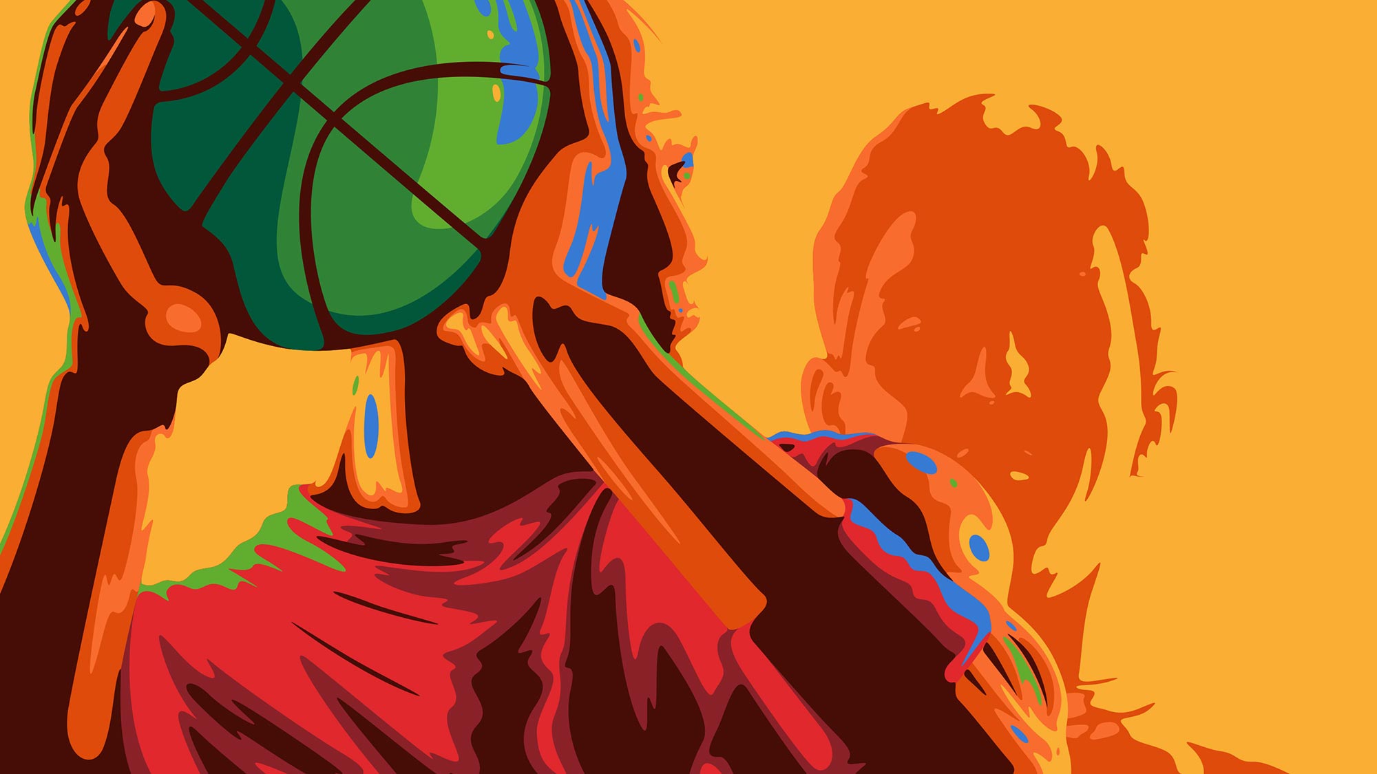
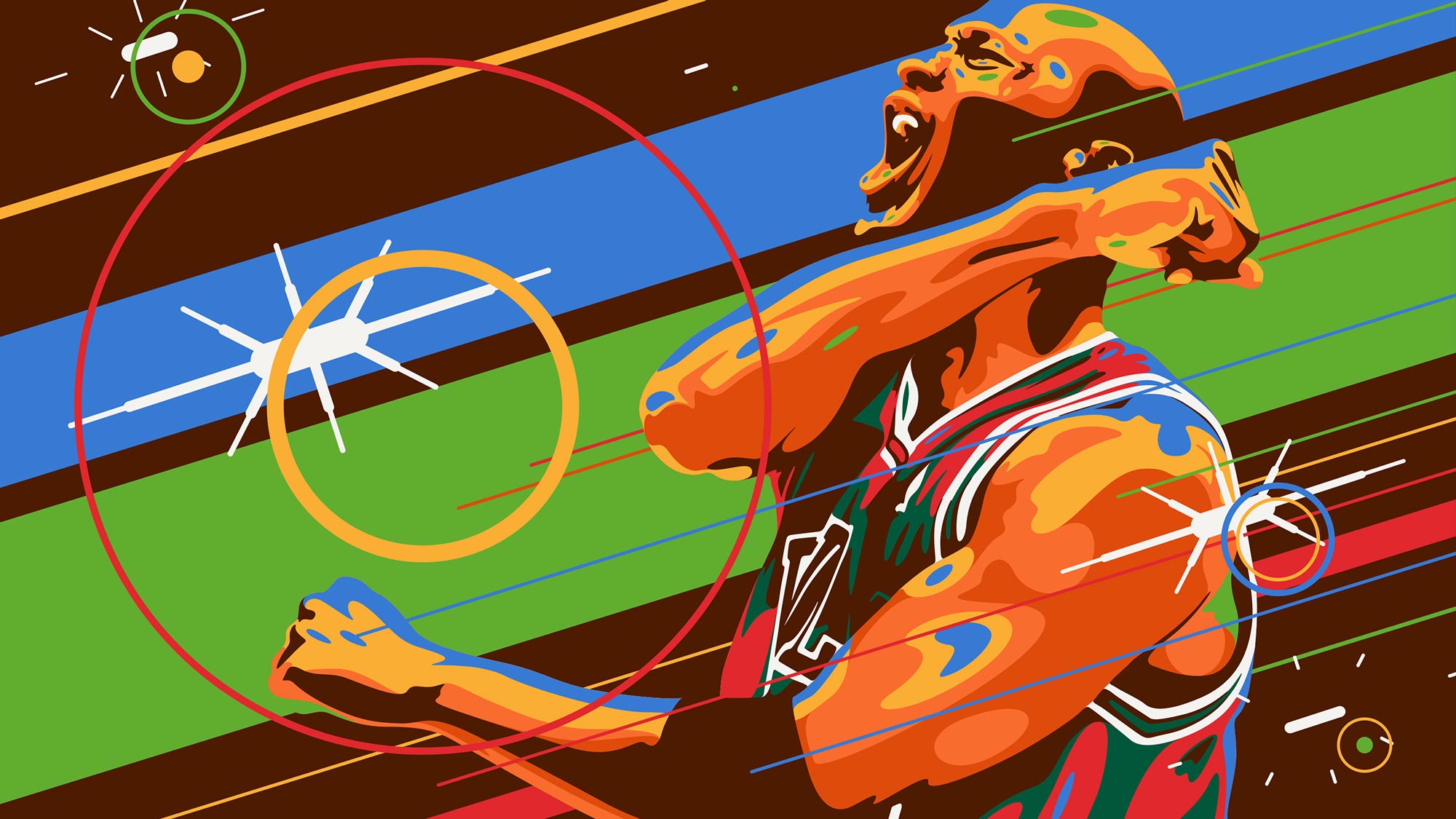
The idea for “Groove Like Mike” was to take elements from the original and build up to what made the legend we know today. The visual approach took inspiration from anime and graphic novels but was remixed combining live action footage with dynamic and vectorial rotoscopy.
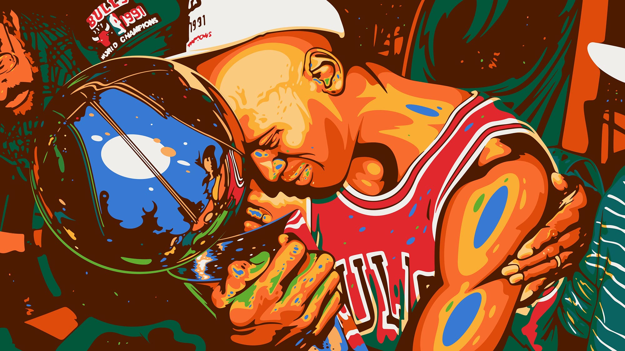
The biggest challenge was to work with the original tape from the 90s commercial, which was in standard resolution. The original footage had different aspect ratio, so shots were scaled/re-framed and some shots were even re-constructed in post. The vector style was drawn in several color layers to enable better blending with the actual footage.
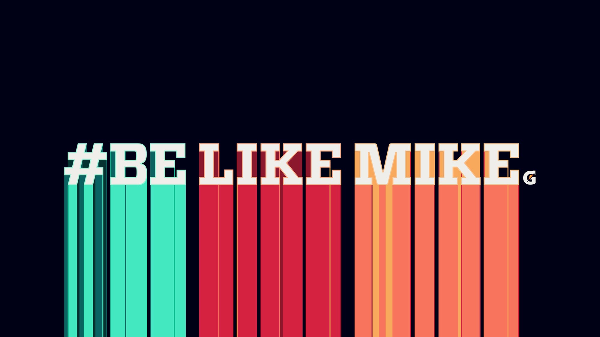
The chosen font family was the Vitesse Serif from Hoefler & Co. No major work was done on the actual type as it fitted the general shape that the brand was looking to achieve. The pack shot closed with a simple animation of the type with speed lines and a bit of color dragging.
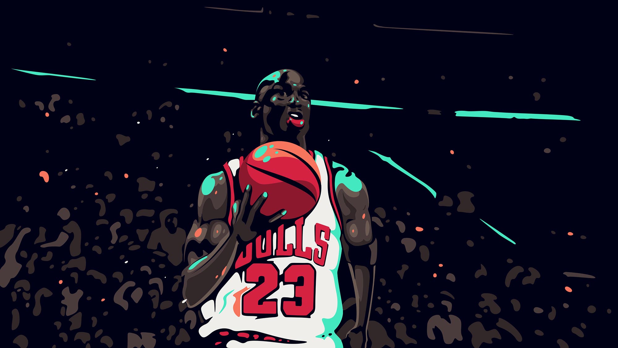
As part of it’s 50th Anniversary Celebration, Gatorade wanted to remaster it’s classic "Be Like Mike" commercial with Michael Jordan. It’s been more than two decades since the original and this project here was just one small part of a big campaign.
The idea for “Groove Like Mike” was to take elements from the original and build up to what made the legend we know today. The visual approach took inspiration from anime and graphic novels but was remixed combining live action footage with dynamic and vectorial rotoscopy.
The biggest challenge was to work with the original tape from the 90s commercial, which was in standard resolution. The original footage had different aspect ratio, so shots were scaled/re-framed and some shots were even re-constructed in post. The vector style was drawn in several color layers to enable better blending with the actual footage.
The chosen font family was the Vitesse Serif from Hoefler & Co. No major work was done on the actual type as it fitted the general shape that the brand was looking to achieve. The pack shot closed with a simple animation of the type with speed lines and a bit of color dragging.
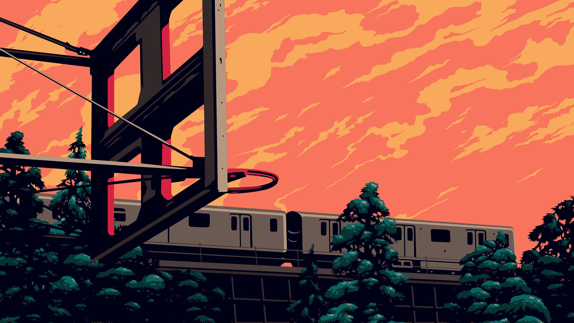
As part of it’s 50th Anniversary Celebration, Gatorade wanted to remaster it’s classic "Be Like Mike" commercial with Michael Jordan. It’s been more than two decades since the original and this project here was just one small part of a big campaign.
The idea for “Groove Like Mike” was to take elements from the original and build up to what made the legend we know today. The visual approach took inspiration from anime and graphic novels but was remixed combining live action footage with dynamic and vectorial rotoscopy.
The biggest challenge was to work with the original tape from the 90s commercial, which was in standard resolution. The original footage had different aspect ratio, so shots were scaled/re-framed and some shots were even re-constructed in post. The vector style was drawn in several color layers to enable better blending with the actual footage.
The chosen font family was the Vitesse Serif from Hoefler & Co. No major work was done on the actual type as it fitted the general shape that the brand was looking to achieve. The pack shot closed with a simple animation of the type with speed lines and a bit of color dragging.
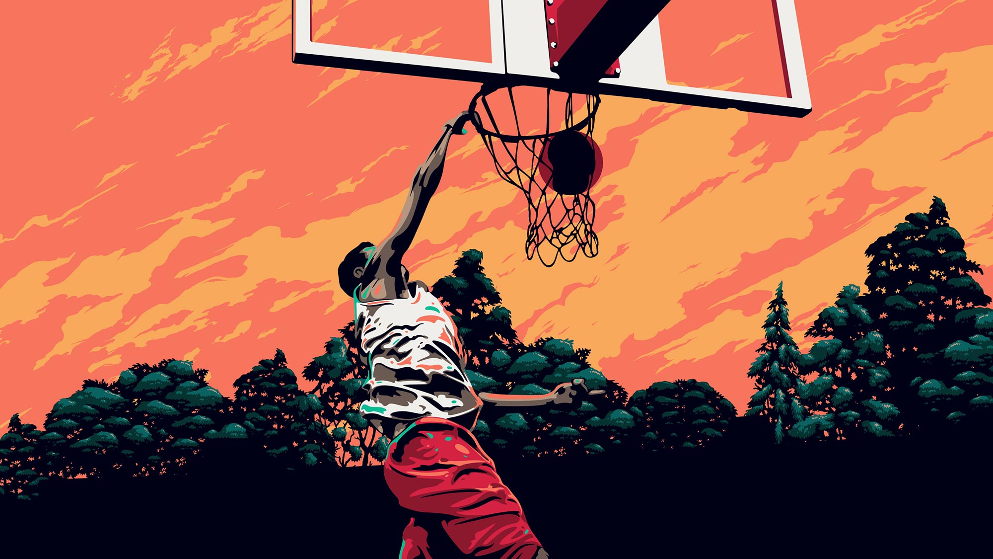
As part of it’s 50th Anniversary Celebration, Gatorade wanted to remaster it’s classic "Be Like Mike" commercial with Michael Jordan. It’s been more than two decades since the original and this project here was just one small part of a big campaign.
The idea for “Groove Like Mike” was to take elements from the original and build up to what made the legend we know today. The visual approach took inspiration from anime and graphic novels but was remixed combining live action footage with dynamic and vectorial rotoscopy.
The biggest challenge was to work with the original tape from the 90s commercial, which was in standard resolution. The original footage had different aspect ratio, so shots were scaled/re-framed and some shots were even re-constructed in post. The vector style was drawn in several color layers to enable better blending with the actual footage.
The chosen font family was the Vitesse Serif from Hoefler & Co. No major work was done on the actual type as it fitted the general shape that the brand was looking to achieve. The pack shot closed with a simple animation of the type with speed lines and a bit of color dragging.
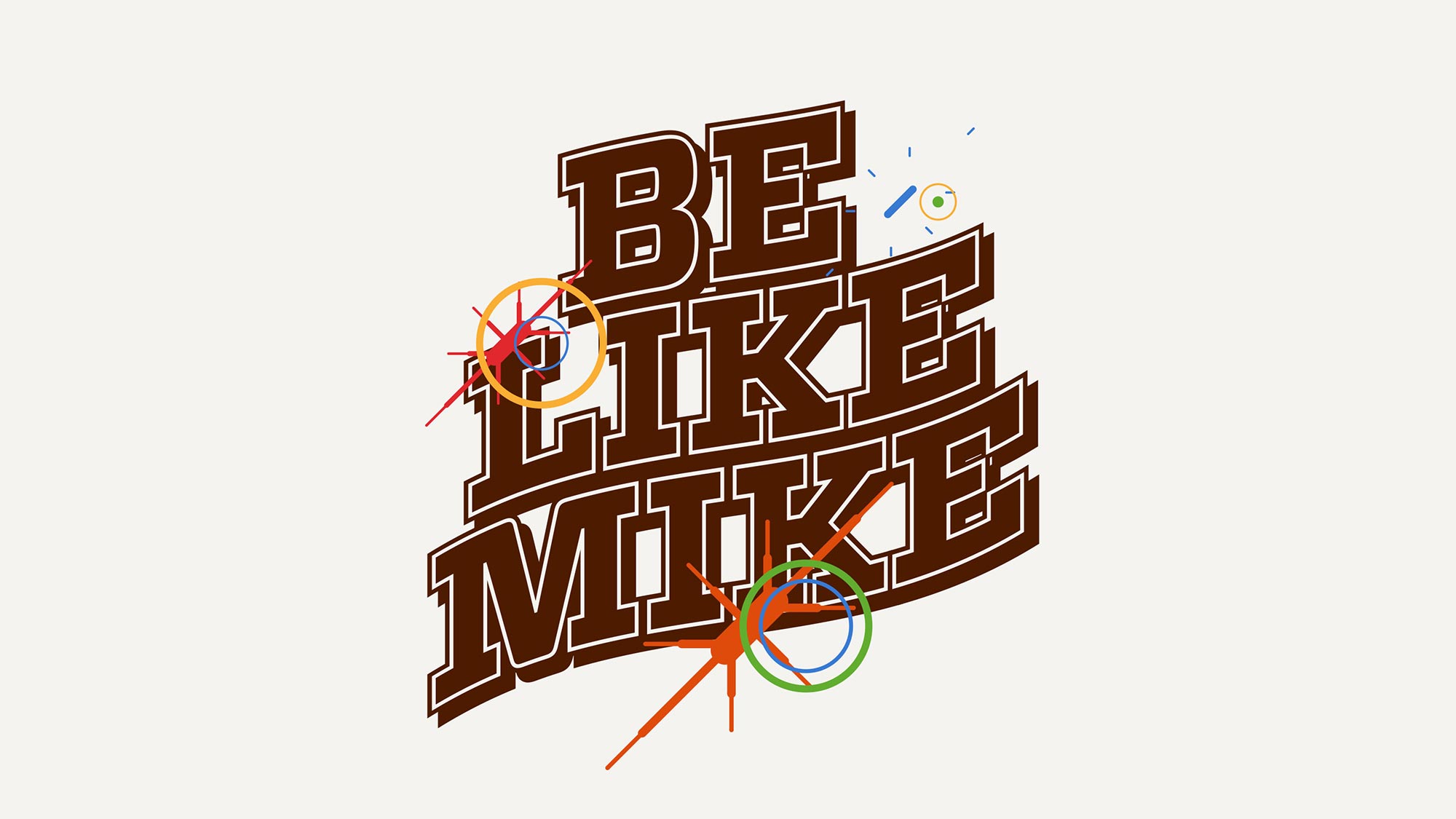
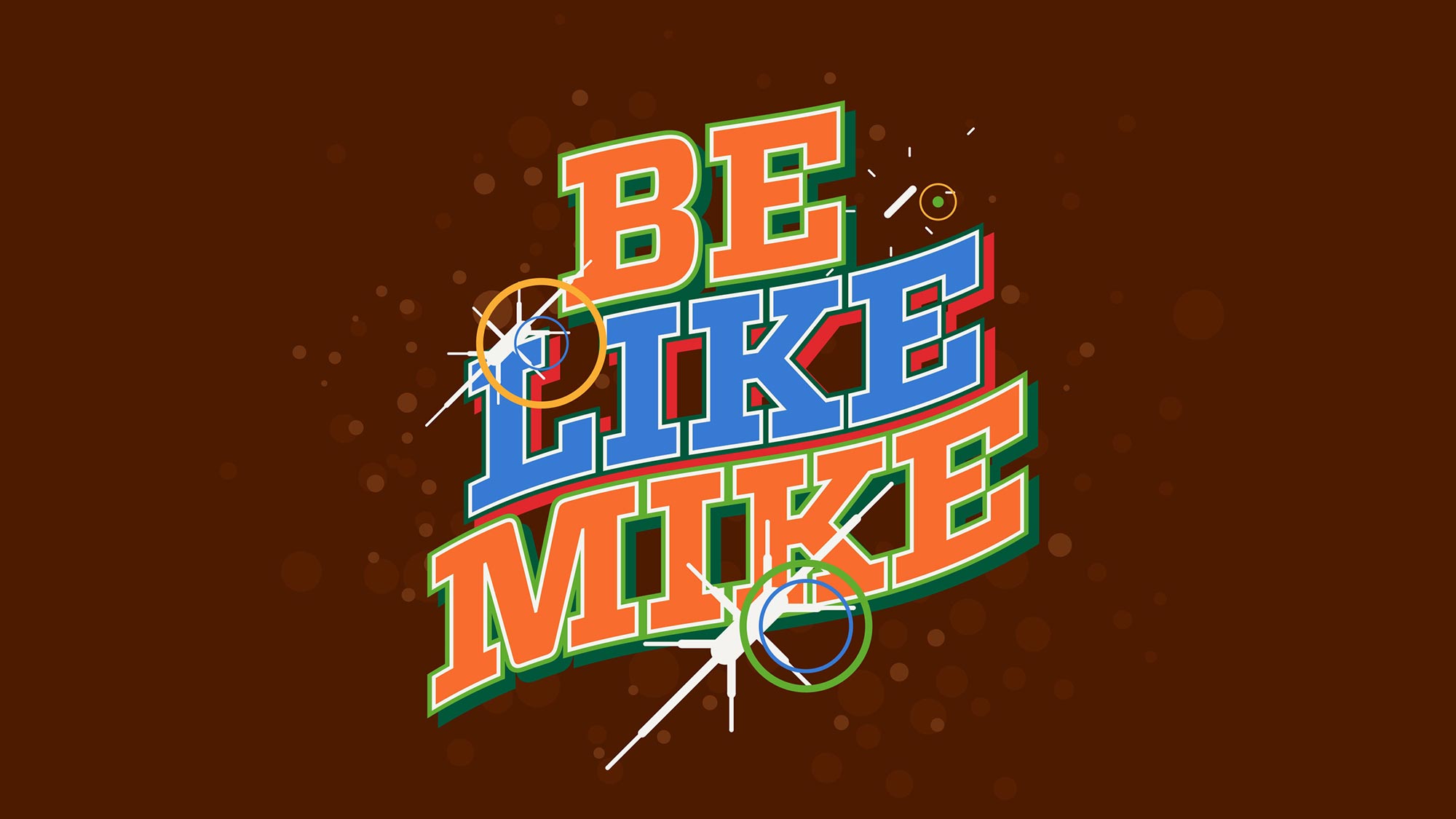
The following images are a collection of the Pitch and early process. On the first stages of the process I wanted to push the idea of the camera flashes along the lines or speed elements. But as the soundtrack and the timing of the commercial kept close to the original; speeding things up was not part of the plan, so that idea was dropped.
Color wise the original pitch images had a lot of personality, but were far from honouring the original Be Like Mike commercial. After going through 5 color combinations we landed on the safest option, still this is nice to see.
Client: Gatorade
Production Company: Tronco
Executive Producers:
Lautaro Brunatti
Leticia Christoph
Creative Director: Tomi Dieguez
Directors:
Henri & Sebastian
Gianluca Fallone
Creative Development:
Laura Gorbatt
Mercedes López
Producer Manager: Juane Paoletta
Post Production Producer: Mechi Serrano
Line Producer: Lucio Fiorentini
Art Director: Gianluca Fallone
2D Animation Leads:
Federico Radero
Pedro Blumenbaum
Music: Animal Music
All material included in this website belongs to Hueso©. It can not be copied, used or modified unless it is stated in a specific contract between the two parts. Hueso©2020 Copyright.
All material included in this website belongs to Hueso©. It can not be copied, used or modified unless it is stated in a specific contract between the two parts. Hueso©2020 Copyright.